

EYES ON CULTURE #026
25 October 2023
Inked Data

EYES ON: Shahryar Nashat’s Reverse Rorschach (2023)
Shahryar Nashat’s installation Reverse Rorschach is a depiction of the artist’s real-time emotional state. Hooked up to monitoring devices for the duration of the exhibition, Nashat’s vitals are recorded, interpreted and then translated into images using the text-to-image generator Imagen. What comes out looks just like the ink blots of a Rorschach test.
Developed in 1921 by psychologist Hermann Rorschach, the Rorschach test uses a patient’s response to a series of abstract inked images to make psychological interpretations. In the test, the image is the input — the stimulus which brings about a response to be interpreted.
As the name suggests, Nashat’s installation flips this on its heads and presents these images as the final result, a graphic interpretation of his self.
WHY WE’RE WATCHING:
The piece digs into the complexity of interpretation between body, machine and image. What was once a visual prompt—the Rorschach abstract image—now holds actual data. But, they look almost identical.
This is interesting because by presenting the information in the culturally significant format of a Rorschack ink blot, the audience, with all their knowledge of how the test works, automatically attempts to interpret the artist from the images.
As one commentator on the piece says, Nashat’s choice to use the Rorschack-style image shifts the responsibility of self-analysis, which is so commonly placed on the artist, onto the audience.


Wet Digital Design

EYES ON: The mysteries of Frutiger Aero
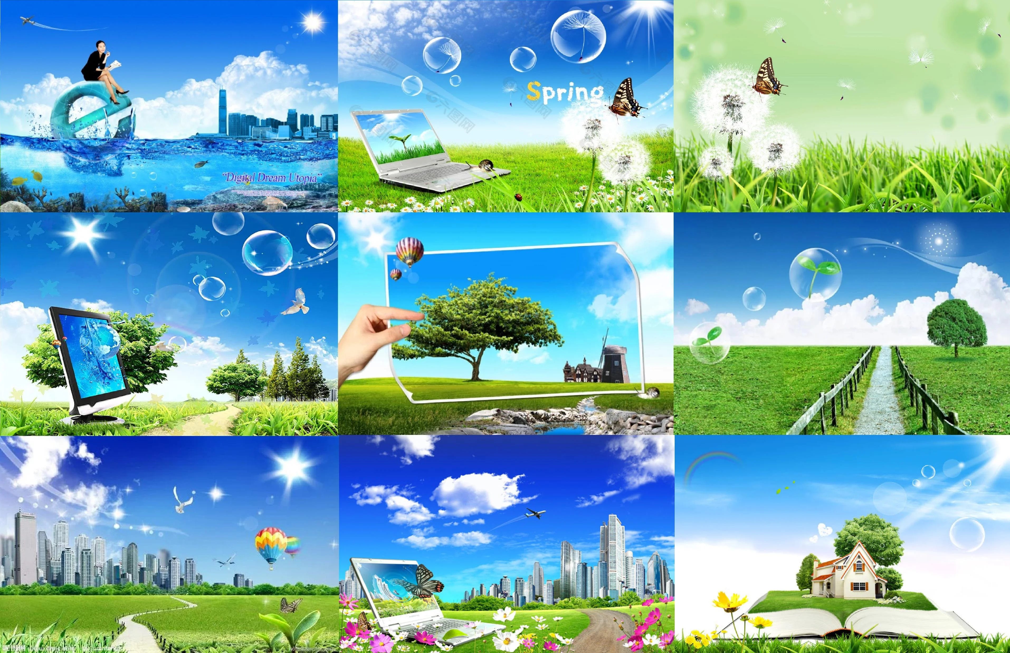
Frutiger Aero is a design trend that took hold across tech-related products of the late 2000s. Its entrance into the collective consciousness can be traced back to the Microsoft Windows XP UI design, which was released in 2001 and achieved extraordinary global adoption. Fresh green grass, perfect wet bubbles, streaming water—clean, natural elements depicted in sharp blues and greens made up the foundation of this digital aesthetic.
The term Frutiger Aero was coined by Sofi Lee, the consumer aesthetics researcher, and has recently seen a huge resurgence of interest on social media. People feel nostalgic, people feel confused—how did a digital aesthetic with such immense visual character ever thrive? Why didn’t we question it then? Where’s all that kitschy character gone now?
WHY WE’RE WATCHING:
Like everything, Frutiger Aero was a product of its environment. So, what makes it so fascinating to us all today is trying to understand what in the world that environment could have been…
Of course, there’s the social explanation for why natural elements were so prevalent in the design schema. Technology was moving from alien to human, from completely foreign to in your hands. Therefore, comforting oceans and serene hills helped to make the transition soothing.
That explanation—that the blues and greens of Frutiger Aero greased in our current relationship with technology—is very straightforward, retrospectively.
But, at the time, there was another practical reason, one that had less to do with the narrative content of these natural images and more to do with their marketing strengths in showcasing the potentials of a screen. No image showed off the sheer definition and hyperreal qualities of an HD screen better than a close up of a dewy flower. The depth of space, the sharp colours, the clear details—all of this was never before experienced, only made possible through these new screens that were being released at the time of this design trend.
So, from our current position of hindsight, Frutiger Aero can be easily explained by numerous sociological explanations as its effects are traced to today. But, it can also be viewed from a very different angle, from the perspective of pure hardware, a perspective wholly oblivious to the persuasive powers of graphic design.
Carpet Preservation
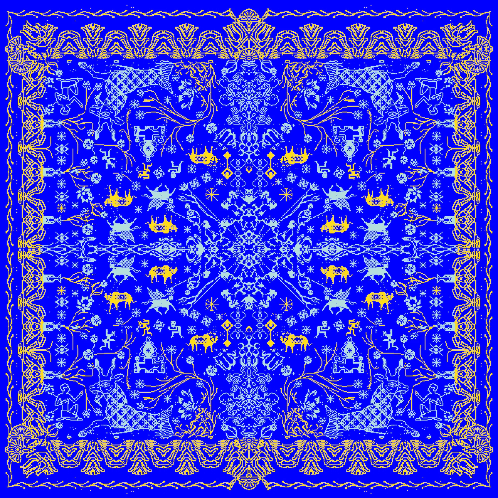
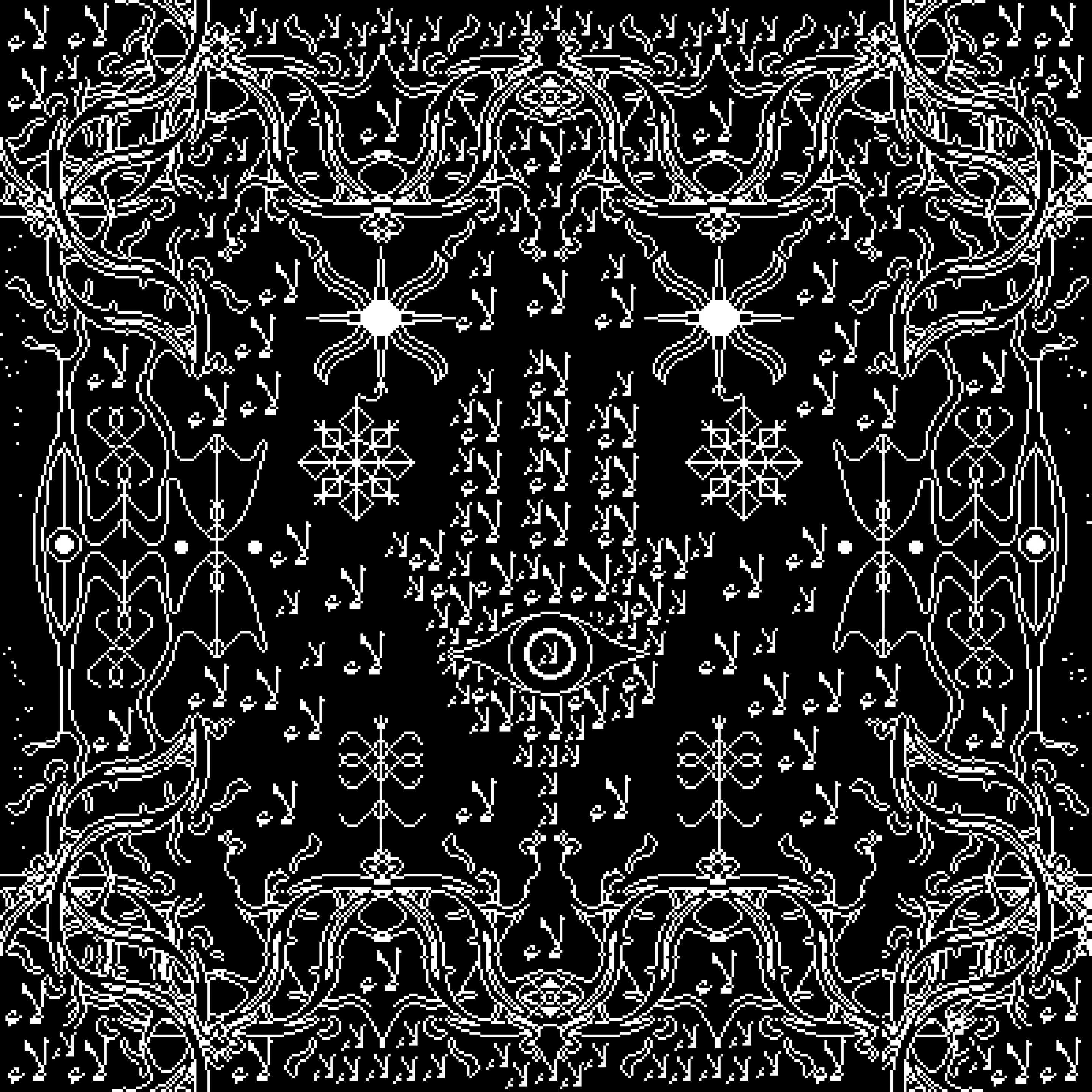
EYES ON: Hussein Shikha’s carpet translations
Hussein Shikha is an artist whose work looks at preservation and translation in the context of the prolific digitalisation of today’s visual culture. Shikha is an Iraqi born artist and has a particular interest in the issue of preservation when it comes to Eastern design perspectives, namely traditional carpet designs.
To explore “the erasure of handmade Iraqi tapestries”, Shikha uses digital tools. He takes the language of the older ways of weaving reality into the new.
WHY WE’RE WATCHING:
Part of what’s so interesting about this work is its stated intention of preservation.
What’s preserved in each of these pieces? Is it the essence of the carpet? or is it just a blueprint that allows for the carpet’s recreation back into the physical?
The question of what exactly is getting preserved in these digital translations feels relevant because of the digital visual language chosen. It’s so un-carpet like. The strength of the pixel is extremely felt in each of the pieces, so much so that a “carpet” is not something visibly obvious. The pixels flatten. They make no effort at creating the illusion of a carpet at all.
In that sense, Shikha’s work sheds light on the art of digital translation—what it actually is and what its intentions are.
What is it that we are trying to carry through when we make things digital? and does that have to look like it does in the physical?