


Type-Face
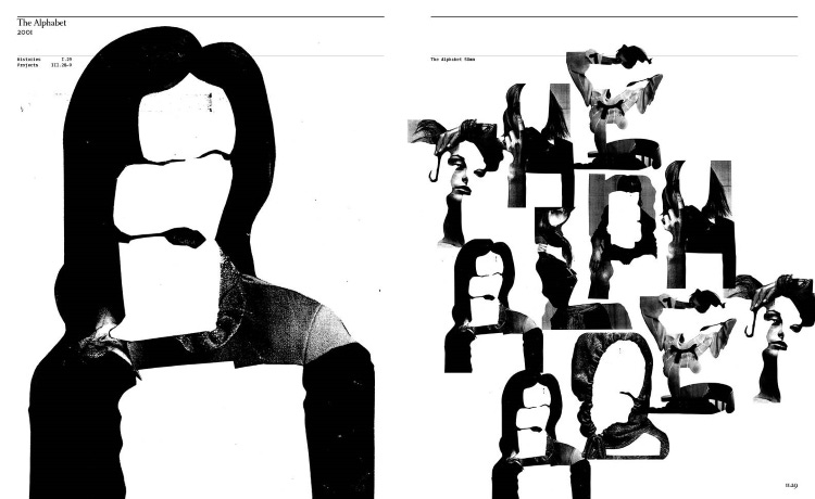


EYES ON: M/M Paris’ The Alphabet (2001)
M/M Paris is an infamous graphic design agency that works across the worlds of fashion, art and music. Their project The Alphabet establishes the lesser-seen crossover between modelling and typography.
A play on the word ‘type-face’, photographs of models taken by Inez van Lamsweerde and Vinoodh Matadin were cut into pieces and reassembled into the first letter of each of the models’ names.
WHY WE’RE WATCHING:
The letterform historian Paul McNeil (who made a book about M/M Paris’ experimental typefaces) describes this project as “an extraordinary collection of letters which play with relationships between reading and looking, while also commenting ironically on the commodification of the female form.”
Playful in so many ways, The Alphabet flips our eyes back and forth between text and image, between body and letter, and between meaning and nonsense.
Iconic Footwear


EYES ON: SUCUK AND BRATWURST’s Ancient Trainers
The Berlin creative collective SUCUK UND BRATWURST created a campaign that cast the Nike sneaker as museum collectible. Pressed into stone, the sole of each Nike shoe blends seamlessly into imaginary ancient objects.
Made up of the same precious materials as the devotional objects, the campaign suggests that the sole of the Nike shoe is as valuable as any museum-grade item, and so should be collected like one.
WHY WE’RE WATCHING:
Photographed in just the same way as a museum object (grey background, no distractions), these ‘artefacts’ exude ancient value. Rendered sacred and priceless, part of what makes these images so convincing is how well they borrow from the language of museum presentation to communicate historic value.
The Nike soles are heralded as modern rituals, perfectly fused into objects of the past.
The Impressionist JPEG
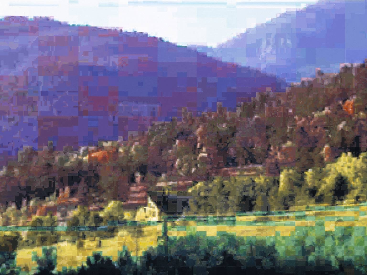


EYES ON: Dan Hays’ Digital Landscape
Surprisingly, Dan Hays’ Colorado Impressions are oil paintings.
Using a series of images of the Colorado landscape that the artist found on the personal website of a local man with oddly the same name as his (another Dan Hays), Hays created these paintings from across the world in his studio in London.
Overly pixelated and steeped in high tonal contrasts, the paintings reflect on the visual information compression that has come with the widespread adoption of the compressible image files, JPEGs.
WHY WE’RE WATCHING:
In stripping away information to imitate poor digital image quality, Hays’ paintings reference the mediated image that defines the digital age. But more than that, in rendering the landscapes in oil paint, Hays’ finds their context in the wider history of image-making:
“There is a parallel between the way computers compress images with “JPEG” and the way that the Impressionists or Cézanne strove to reduce the amount of painted information to aid in speed of production and capture, yet also to reveal the essence of a scene.” - Dan Hays
So, in reducing the visual information of the paintings to recall similar abstract landscapes of the past, a bridge across more than a century of images is built.
WHOSE EYES: Velimar Molina, Socials @ DRAUP